From ancient cave paintings to a 2012 Taylor Swift album release, few colors evoke such feelings as red, one of the oldest and most complex colors of the visible light spectrum. Without starting a symbolic dissertation, red suggests the entire gamut of human emotion relative to its culture of display. It can symbolize life, passion and love or it can symbolize blood, destruction and evil depending on its cultural context, further suggesting a dualistic color at its essence. It’s the chosen color of revolutions and so attention grabbing that people swear red cars get pulled over more frequently. The color red is packed with physical and emotional weight from antiquity to modernity, so on this day of Valentine’s we decided to muse about a color we will forever love (and also sometimes hate).
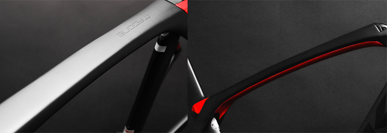
Red is a most difficult paint color to match because it requires an extremely complex and harmonious synthesis of identical paint-matching prior to application, an ideally saturated mix and finally expert layering on the actual frame. First it starts with matching not one, but two coats of paint: factories paint frames with a top-coat and base-coat so the blend must match both these layers. This task is easier in concept than reality for even factory-painted frames can vary greatly among batches. The painter needs to take stock of the entire color range of the frame before committing to the paint selection.
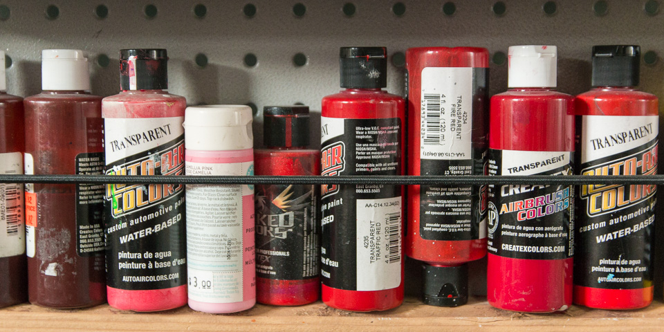
The second challenge to overcome is one of saturation, which is the the density of any color relative to pure white. This paint-mixing step is more straightforward than paint-matching, but complicated nonetheless because a small portion of white paint only requires a few drops of red for that perfect blend. If the chosen shade is over or undersaturated the final application will look much too dark or too light, which brings us to our final step: layering.
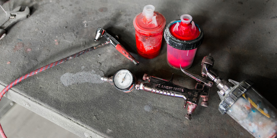
It’s now down to the actual, physical sprayed-on application of the mixed paint. Layering is an absolutely crucial component of this process and completes the relationship of mixture and saturation. If you have an oversaturated mix then you need to apply less layers. Less layers can mean that the paint could be see-through or leave recessed ridges where the frame transitioning from repair zone back to the factory color area. If undersaturated, the opposite is true and the frame will require more coats, potentially making ridges over your transition zones.
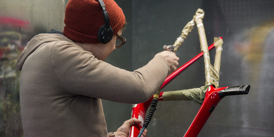
So as you can see, red is a color far more complex and difficult than meets the eye. Everything we do here at Ruckus is extremely detail-oriented and the re-application of red colors to repaired carbon frames is no exception. Do you have a broken, red carbon frame needing repair? Let us be your valentine, we’ll mend your broken heart and frame.